The Telegraph (2025)
- May 19
- 2 min read
White paint is probably one of the most deceptively complicated parts of designing a home. It’s often treated as the simplest decision in a project - something neutral, safe or easy to choose - when in reality it can completely shape the atmosphere of a space.
Recently, Leo spoke with The Telegraph about how to choose the right white paint for your home, sharing thoughts through the lens of our Victorian Terrace Waterloo project.
White Paint Is Never Just White
One of the biggest misconceptions in interior design is that white works universally.
In practice, white changes constantly depending on the orientation of a room, the quality of natural light, the architecture of the building and the materials surrounding it. A shade that feels warm and soft in one home can suddenly appear cool or flat in another.
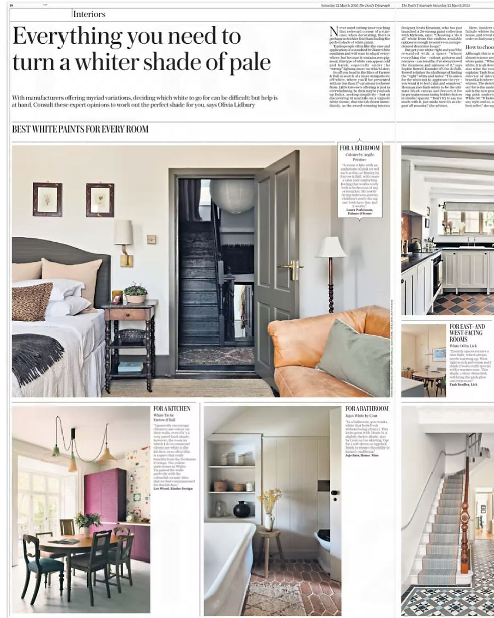
Within the project, the palette was designed carefully to sit alongside the richer textures and colours used throughout the project - including the plum-toned kitchen cabinetry, natural timber finishes and softer layered materials elsewhere in the home. The aim was never stark contrast, but balance.
Creating Softness Through Colour
When designing residential interiors, we’re often thinking less about individual colours in isolation and more about how a home feels as a whole.
Paint quietly influences almost everything - how light moves through a room, how materials sit together and ultimately how calm or comfortable a space feels to live in day-to-day.
For this project, softer whites helped create moments of lightness and calm around the more expressive areas of the design, allowing the stronger colours and textures within the kitchen to feel grounded rather than overwhelming. It’s often these quieter decisions that have the biggest impact over time.
The Telegraph Highlights A More Considered Approach To Interior Design
At Kinder Design, we’re always drawn to homes that feel layered, personal and easy to live in rather than overly trend-led or overly polished.
The Victorian Terrace Waterloo project became a reflection of that approach - balancing warmth, texture and practicality whilst still allowing moments of individuality and playfulness to come through. It was lovely to contribute to The Telegraph’s wider conversation around paint, colour and creating homes with longevity.
You can read the full feature here:


