Softly Spoken Colour: Inside our Contemporary Family Home
- Oct 27, 2025
- 2 min read
Updated: Oct 28, 2025

This light-filled home is a lesson in subtlety - proof that colour doesn’t have to shout to make an impact. Our Coach House project (which also happens to be my home) balances warmth, restraint, and personality through a carefully considered palette from Paint & Paper Library’s Architectural Colours collection.
Rather than leaning into the trend for stark white minimalism, we embraced the idea of using colour as a neutral - selecting hues that shift gently with the light, creating calm, cohesive transitions from room to room. The result is a space that feels both contemporary and deeply lived in: quietly expressive, gently layered, and full of character.

A Colour Palette That’s Gentle - but Never Bland
We chose a combination of Willow III, Slate I, Willow I, and Plaster II, creating a harmonious flow that moves through the home like a soft rhythm.
Each shade plays a distinct role:
Slate I anchors the palette - a perfect all-round neutral that pairs effortlessly with both warm and cool tones.
Willow I and III introduce a whisper of green - bringing freshness and connection to nature without overwhelming the space.
Plaster II softens the edges with a hint of blush, adding warmth and a subtle sense of comfort.
Together, these colours work as a modern alternative to plain white walls, creating depth and personality while still feeling airy and timeless.

Light, Space and Family Life
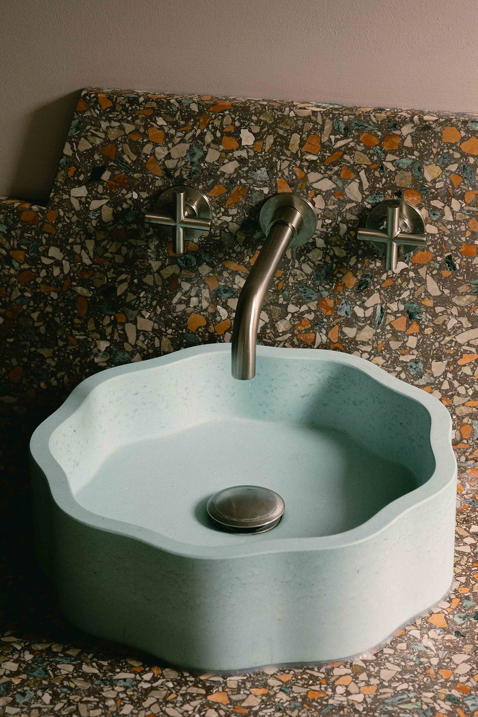
This home was designed with the realities of family living in mind. Natural light floods through tall sash windows, bouncing off soft-toned walls and pale timber floors. The finishes are robust yet refined - practical enough for daily life but chosen with a designer’s eye for longevity.
Each room feels distinct but connected, the kind of flow that makes a home feel intuitively “right.” The Architectural Colours provide a subtle backdrop for evolving layers of art, textiles, and personal pieces that tell the family’s story.

Timeless, Thoughtful Design
At Kinder Design, we believe the most successful interiors are the ones that feel effortless - spaces that evolve gracefully over time rather than demanding constant reinvention. This project embodies that approach perfectly: calm but not cold, minimal but not sterile, beautiful but built for real life.
Whether it’s a family home, a pied-à-terre, or a single room refresh, our goal is always the same - to create spaces that feel deeply personal and quietly confident.
If you’d like to work with us on your own home transformation - whether you’re renovating, reimagining or simply refreshing - get in touch. We’d love to help you find your perfect palette.