Book Review, Number Two: The Little Book of Colour
- 5 days ago
- 2 min read

Tonal Harmony & Why Some Spaces Just Feel Right
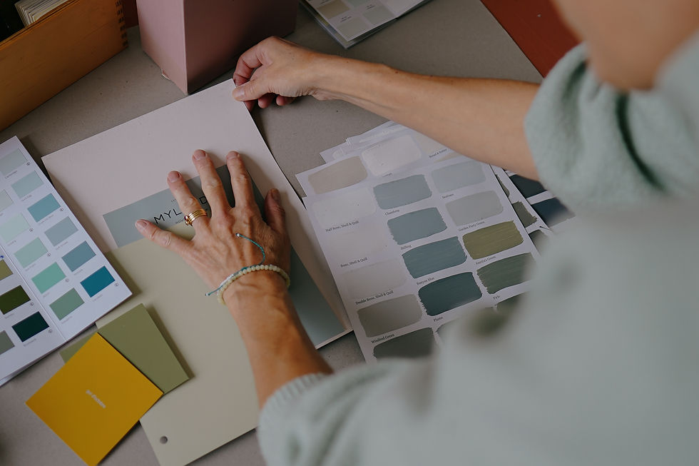
One of the ideas in the book that particularly stayed with me is tonal colour harmony - the theory that colours broadly sit within four tonal families: spring, summer, autumn and winter.
The idea is that palettes often feel most cohesive when colours are selected from within the same tonal grouping, rather than pulling from conflicting families.
It’s something I’ve found incredibly useful both professionally and instinctively.
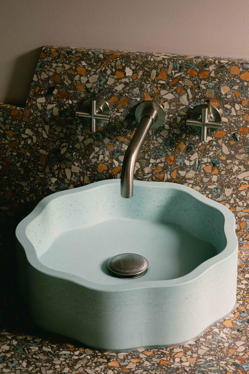
When building residential interior design schemes, I often notice clients repeatedly gravitating towards colours that share a similar tonal quality, even when they believe their tastes are eclectic. Understanding those patterns can help create interiors that feel naturally balanced and emotionally coherent without necessarily feeling overly “designed”.
I think this is often the difference between a home that simply looks attractive and one that feels deeply comfortable to be in.
The Emotional Side Of Colour
The second idea that really resonated with me was Haller’s framework for the three ways we each relate to colour.
The first is personal memory - colours associated with particular experiences, people or moments in our lives.
The second is cultural and symbolic meaning, which shapes how we collectively interpret certain colours.
But it’s the third layer that interests me most: the more subconscious emotional response to colour that exists beyond logic or memory.
I think that’s often where the real emotional power of interior design sits.
A lot of what we do at Kinder Design isn’t simply about creating visually pleasing spaces. It’s about shaping atmosphere. Trying to understand why one room feels grounding while another feels energising, restorative or quietly uplifting.
Colour plays a huge role in that, often in ways people can’t immediately explain.
Why Colour Should Feel Personal
One of the things I always try to encourage clients to move away from is the idea of choosing colours purely because they’re “safe” or trend-led.
The most memorable interiors are rarely the most neutral or the most dramatic. They’re usually the spaces where colour has been used thoughtfully and instinctively - where it reflects personality, mood and the way someone wants to live within a space.
That doesn’t necessarily mean bold interiors. Sometimes it’s the softest tonal shifts that create the strongest emotional response.
Across many of our residential renovation projects, colour becomes one of the key tools we use to create warmth, individuality and emotional connection within a home. It’s rarely just decorative.
Final Thoughts
The Little Book of Colour is by no means the final word on colour psychology, but it’s an incredibly approachable and thoughtful starting point into a surprisingly complex subject.
And for anyone interested in interiors, creativity or simply understanding why certain spaces make them feel the way they do, it’s well worth adding to the bookshelf.
I’ve written more about our approach to colour and residential interior design over on my earlier blog post Colour isn't decoration, it's a tool if you’d like to explore the subject further.